
What Colors Make a Small Living Room Look Larger? A Practical Guide to Paint Choices That Open Up Space

If you want a small living room to feel bigger, the safest place to begin is with light, low-contrast colors. Soft whites, off-whites, pale greiges, light beige, and muted cool tones tend to make walls feel farther away because they reflect more light and reduce the visual weight of the room. Benjamin Moore notes that lighter paint colors like off-whites, light neutrals, pales, and pastels can help create the impression of larger, brighter rooms, and that is the core principle to keep in mind. Benjamin Moore’s small-room color guidance is a useful starting point.
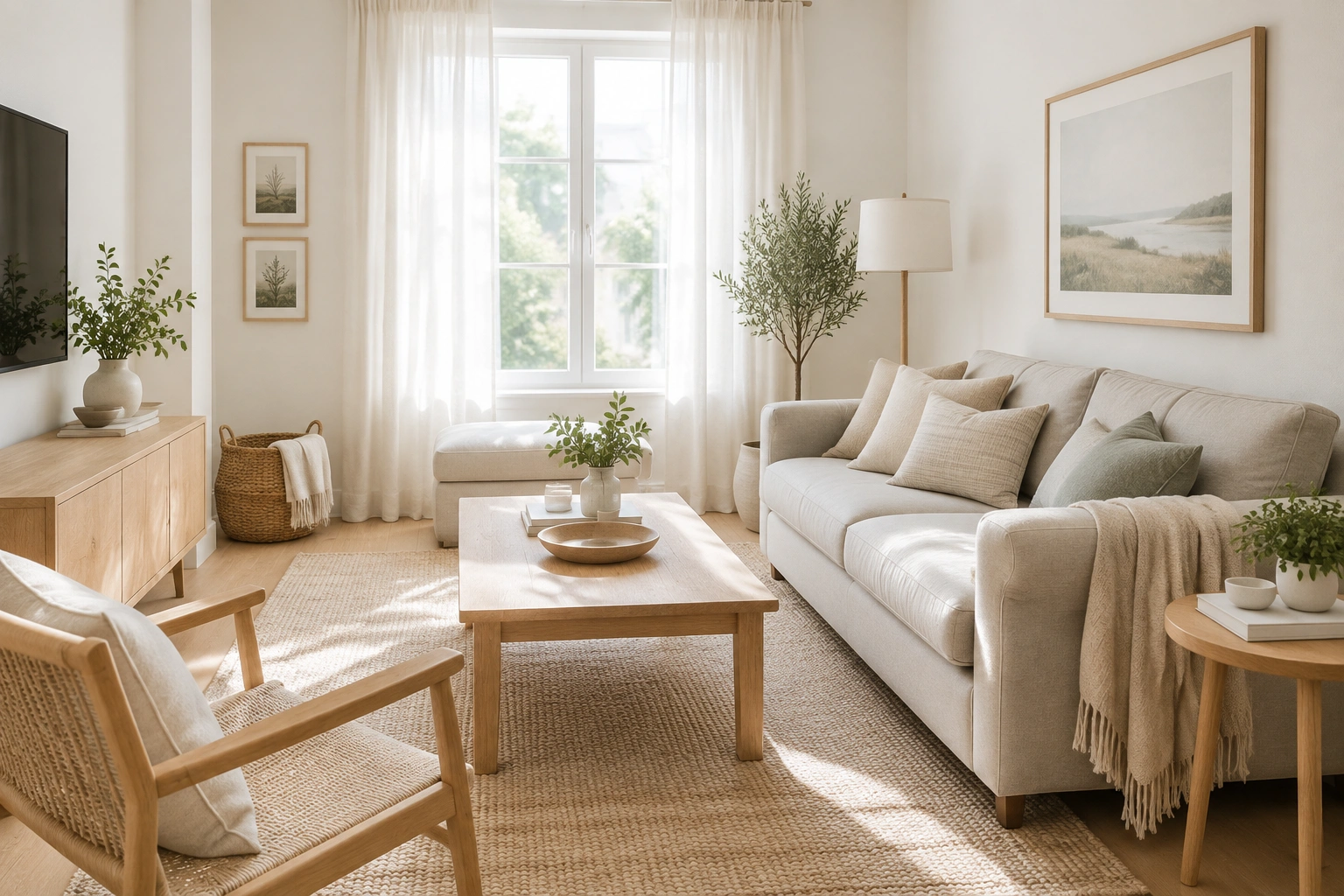
If you want the shortest answer: choose a soft, light neutral with a gentle undertone, keep the ceiling close in color, and avoid sharp contrast unless you’re using it very intentionally.
A small room does not need to be white to feel open. In many living rooms, a warm off-white or pale greige looks more relaxed and less stark than a bright, cool white. If your room is narrow, a soft blue-green can also help because cool colors are often used as a receding visual effect in design. That can make the far wall feel farther away, which is especially helpful in long, thin living rooms.
The quickest way to choose a color that feels bigger
Before you compare paint chips, ask four questions:
-
How much light does the room get?
Bright rooms can handle cooler whites and softer contrast. Dim rooms usually need warmer, softer colors so they do not feel gray or chilly. -
What direction does the room face?
North-facing rooms often read cooler and can make some whites look blue or flat. South-facing rooms usually tolerate cleaner whites and cooler undertones better. East- and west-facing rooms change throughout the day, so test samples morning and evening. -
What already takes up visual space?
Dark floors, a deep-colored sofa, heavy curtains, and lots of black accents all add weight. If those are already in the room, the walls usually work harder when they stay light and quiet. -
Do you want airy, cozy, or dramatic?
“Bigger” and “brighter” are not always the same as “coziest.” A pale neutral can open the room, while a deeper color can add mood if the rest of the room stays light.
A simple decision rule: if the room is small and low-light, choose a color that is lighter than you think you need. If the room is small but bright, you have more room to play with undertone and depth.
Best paint colors for small living rooms
Here is the practical breakdown I use when helping someone choose a room-expanding palette.
| Color type | Why it works | Best for | Trade-off |
|---|---|---|---|
| Soft white | Reflects light and keeps the room airy | Bright rooms, modern spaces, renters who want a clean backdrop | Can feel cold or sterile if the undertone is too crisp |
| Off-white | Still bright, but softer and warmer than pure white | Most small living rooms, especially with warm floors or wood furniture | Needs careful undertone matching |
| Pale greige | Gives openness without looking stark | Rooms that need warmth and flexibility | Can go muddy if the room lacks light |
| Light beige | Adds warmth and comfort | North-facing or dim rooms that need softness | Too much yellow or orange can make the room feel heavier |
| Soft blue | Creates a receding effect and adds freshness | Narrow rooms, rooms with decent daylight | Can feel chilly in low light |
| Muted blue-green | Adds depth while still feeling airy | Long rooms, rooms that need visual length | Stronger undertones can clash with warm flooring |
| Pale sage | Calm and light, with a natural feel | Small living rooms that should feel relaxed, not sterile | Too much gray can make it look flat |
Soft whites: the cleanest way to expand a room
A white wall can visually expand a room, but white is not automatically the best choice. In a small living room, the wrong white can feel harsh, especially if the room gets little natural light or has cool floors.
Look for whites with a gentle undertone:
– Warm white if your room has oak, beige carpet, brass, creamy upholstery, or warm wood tones
– Clean white if your room has gray flooring, black accents, crisp modern furniture, or lots of daylight
– Soft white if you want a flexible middle ground that works with both warm and cool elements
If you want the room to feel calm rather than crisp, off-white often beats bright white.
Off-whites and pale neutrals: the easiest all-around answer
Off-whites and pale neutrals are often the most forgiving choice for small living rooms because they brighten without looking severe. They work especially well when you want the walls to blend quietly with trim, curtains, or a light rug.
This is where undertones matter. A pale neutral with a pink-beige undertone will feel warmer. A pale neutral with a green-gray undertone will feel cooler and more modern. Neither is wrong; the better one is the one that supports what is already in the room.
Cool blues and green-blues: the best choice when you want depth
If your living room is narrow, a soft blue-green can help the room feel deeper. Interior designer Michael Helwig describes this as a design principle: cool colors are often perceived as receding, so using a soft blue-green on the far wall of a narrow room can help that wall feel visually farther away. That makes the room read as longer and deeper. You can see that reasoning in his write-up on paint colors that make small rooms feel bigger.
This is a strong option if:
– your room is long and thin
– you want more personality than white or beige
– the room gets enough light to keep the color from turning dull
Muted celadon, seafoam, sage-leaning aqua, and dusty blue-green all fit this family.
Light vs. dark colors: what actually works in small spaces
The common rule is simple: light colors make a small room feel larger, while dark colors tend to make it feel more enclosed because they absorb light. That basic idea is true, but it is not the whole story.
Light colors work because they bounce more light around the room. That makes walls and ceilings feel less fixed and less close. Dark colors do the opposite. They absorb light and can pull surfaces visually inward.
But dark colors are not forbidden in small living rooms. They just need more structure.
When dark colors can still work
A deeper color can work if the room’s overall lighting, finish, and surrounding colors are working with it rather than against it. Strong natural light helps, but so do lighter floors, a bright ceiling, and controlled contrast elsewhere.
Dark shades that tend to work best in small living rooms are usually the softened, muted ones:
– navy with a gray or dusty undertone
– charcoal that reads warm rather than flat black
– forest green with depth but not too much saturation
– deep blue-green with a softened, smoky finish
These colors usually work better than very pure or very high-contrast darks, which can feel heavier in a compact room.
A deeper color is often best when:
– the room gets good daylight at some point in the day
– you use it on one wall rather than all four
– the ceiling and trim stay light
– the furniture does not add even more heaviness
If the room is already dim, has low ceilings, or contains a lot of dark furniture, it is usually better to keep the walls lighter and use dark color in smaller doses.
If you love depth, use it deliberately. If your goal is “larger and brighter,” keep the dark shades as accents, not the main event.
Undertones, trim, and ceiling color: how to reduce visual breaks
Small rooms feel busier when the eye keeps stopping. Every strong contrast creates a boundary. That is why walls, trim, and ceilings that are too different can make a room feel chopped up.
Keep the ceiling close to the wall color
A good rule of thumb:
– Match the ceiling to the walls when the room is small, the ceiling is low, or you want the room to feel calm and continuous.
– Keep the ceiling lighter when you want a bit more lift, especially in rooms with average or higher ceilings, or when the wall color is deeper.
– Avoid a stark white ceiling if the walls are already very light and the room is compact, unless you specifically want a crisp, framed look.
Painting the ceiling the same color as the walls, or a very close tint, can reduce the line where the room ends. That makes the space feel calmer and less segmented. This is especially useful in small apartments and older homes with low ceilings.
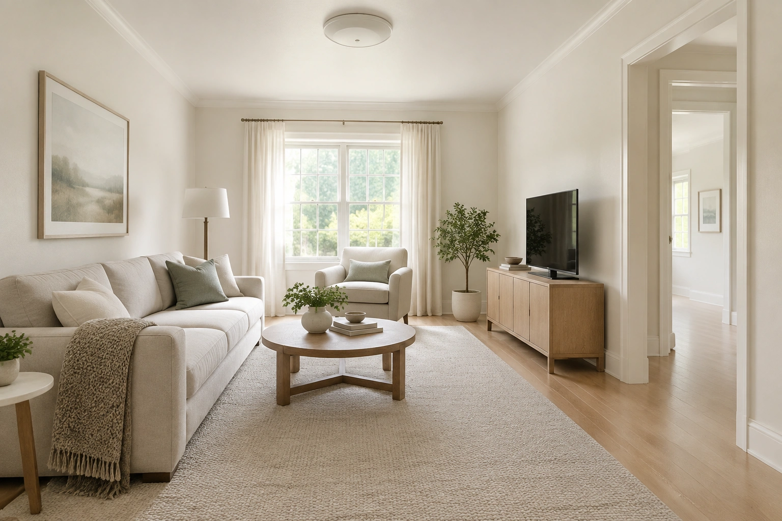
If you want the ceiling lighter, keep the shift subtle. A slightly brighter version of the wall color usually works better than a sharply different white in a room that already feels compact.
Trim: white is not always the best move
White trim can look crisp, but in a small room it can also create hard edges. If the wall color is soft and muted, trim that is only a little lighter than the walls can feel smoother and more expansive.
Use low-contrast trim when:
– the room is tiny
– you want a softer, more continuous look
– the room already has a lot of visual activity from furniture or decor
Use crisp white trim when:
– you want a classic, tailored look
– the room has enough light to support contrast
– the wall color is deeper or more saturated
Watch the undertones, not just the color family
Two “white” paints can look completely different next to the same sofa. One may lean pink, another yellow, another blue-gray. That is why a white that looks beautiful in a showroom can feel wrong at home.
Match undertones to what is already in the room:
– warm floors pair better with warm whites, creamier off-whites, and beige-neutrals
– gray floors often look better with cleaner whites or cooler neutrals
– wood furniture can bridge either direction if the undertones are not fighting each other
Which paint finish makes a small living room look larger?
Finish matters because it changes how much light a wall sends back into the room.
Matte finish
Matte hides wall imperfections well and gives a soft, calm look. The trade-off is that it reflects less light, so it can make a room feel quieter and less reflective than eggshell or satin. That can be nice if you want softness, but it is not automatically the most space-expanding choice.
Eggshell finish
Eggshell is often the best balance for a living room. It reflects more light than matte, but it is still forgiving enough for everyday walls. If your room is small and not perfectly smooth, eggshell is usually the safest practical choice.
Satin finish
Satin reflects even more light, which can help a dim room feel brighter. The trade-off is that it can highlight bumps, patches, or uneven drywall. Use it if your walls are in good shape and you want a bit more glow.
If you want the room to feel larger without making flaws obvious, eggshell is usually the sweet spot.
Step-by-step: how to pick the right color for your living room
Here is the process I would use in a real home.
1. Identify the room’s biggest challenge
Is it too dark, too narrow, too busy, or too cold? Pick the main problem first. A room that is dark needs more light reflection. A room that is narrow may benefit from a receding cool tone. A room that feels busy needs less contrast.
2. Look at what cannot change
Flooring, sofa color, large shelving, and major curtains matter more than the throw pillows. Choose wall color to support the largest fixed pieces.
3. Narrow the palette to two or three families
For most small living rooms, that means:
– soft white
– off-white
– pale greige
– light beige
– muted blue-green
4. Sample on more than one wall
Paint swatches on poster board or sample patches on different walls, then check them in morning light, afternoon light, and at night with lamps on. A color that looks airy in daylight can flatten under warm bulbs.
5. Compare the sample to your ceiling and trim
If the sample makes the trim look too bright or the ceiling look low, the contrast may be too strong. If the room looks flat, you may need slightly more depth or a better undertone.
6. Choose the quietest color that still feels alive
In a small room, the best color is often the one that does not fight for attention. It should make the room feel easier to look at.
How to make dark colors work without shrinking the room
If you love a deeper wall color, use it with a light-support system.
A practical formula:
– dark or medium-dark wall color
– ceiling in soft white or near-white
– trim close to the wall color or a soft contrast
– light rug
– lighter curtains
– one or two reflective surfaces, like glass or a metallic lamp
The goal is to keep the room from becoming visually heavy from floor to ceiling. A dark wall can feel elegant, but only if something in the room still lifts the eye.
One useful tactic is to keep the darkest color below eye level or on a single focal wall. That gives you depth without wrapping the whole room in shadow.
Common mistakes that make a small living room feel smaller
Here are the traps I see most often:
-
Choosing a bright white without checking undertones
The room can end up feeling cold or clinical. -
Using strong contrast everywhere
White trim against dark walls, dark furniture, dark curtains, and a patterned rug can make the room feel chopped into pieces. -
Ignoring the light direction
A color that works in a sunny room may look dull in a north-facing one. -
Picking a finish that is too flat in a dim room
Flat paint can absorb too much light. -
Adding too many accent colors
A small room usually feels better with one main color story and a few quiet accents.
Practical color schemes for real small living rooms
North-facing room
Try a warm off-white, creamy beige, or pale greige with eggshell finish. These colors help offset cool daylight and keep the room from feeling blue or gray. Pair them with trim that is either the same family or only slightly brighter, and keep the ceiling a soft off-white rather than a stark white if the room feels low.
Narrow apartment living room
Try a muted blue-green or soft celadon on the longer walls, or use the same pale neutral on all walls and ceiling to reduce breaks. This helps the room feel longer and calmer. If you want trim, keep it low-contrast rather than bright white so the room does not feel segmented.
Small room with dark sofa and flooring
Use a light wall color with low-contrast trim and a ceiling that stays soft and bright. A warm off-white or pale greige often works well here because it balances the heavier pieces without feeling harsh. Let the sofa be the anchor, not the whole room’s visual weight.
Rental where repainting is limited
If you cannot repaint, use color through curtains, rug, art, and textiles. Keep those in light neutrals, soft blues, or muted greens so they reinforce the same open feeling. If paint is off-limits, peel-and-stick wallpaper on a single wall or removable decor in a quiet palette can still support the color strategy without a permanent change.
For renters who need layout help as well as color help, this guide on making a small living room feel balanced without crowding it pairs well with a room-expanding color plan.
Troubleshooting: when the color looks too cold, too dark, or too flat
If the paint looks wrong after it dries, do not panic. Usually the fix is one of three things.
Too cold
Add warmth through lamps, wood accents, a cream rug, or a softer off-white trim. If the wall color itself is icy, the undertone may be too blue-gray for the room.
Too dark
Increase the light around the room first. If the color still feels heavy, the issue may be that the room needed a lighter value, not a different undertone.
Too flat
The room may need more contrast between wall, trim, and textiles. A nearly identical wall and trim color can feel soothing, but if everything is the same value and texture, the room can lose energy.
Simple decor choices that support a bigger-looking room
Paint does a lot of the work, but the rest of the room should help it.
- Choose curtains close to the wall color so the windows do not feel boxed in.
- Use a rug that is lighter than the floor if you want the floor area to feel more open.
- Keep large furniture visually light when possible: exposed legs, softer upholstery, fewer bulky silhouettes.
- Limit high-contrast patterns to one or two places.
- Repeat the same few colors around the room so the eye moves smoothly.
If the room feels crowded, the issue may not be the wall color at all. It may be too many competing tones.
The simplest answer
What colors make a small living room look larger? Usually the ones that are light, soft, and low-contrast. Soft whites, off-whites, pale greiges, light beige, and muted cool tones tend to make the room feel brighter and more open. If you want depth, a muted blue-green can help a narrow room feel longer. If you want the room to feel bigger overall, keep the ceiling, trim, and decor working with the walls instead of fighting them.
FAQ
Should trim be white or the same as the walls in a small living room?
Either can work, but the rule of thumb is simple: if you want the room to feel larger and calmer, keep trim low-contrast or close to the wall color. If you want a more classic, crisp look and the room has enough light, white trim can work well.
Should the ceiling be the same color as the walls?
In a small room, matching the ceiling to the walls or keeping it very close usually makes the room feel more continuous. If you want a bit more lift, keep the ceiling only slightly lighter rather than sharply white.
What is the best white paint for a small living room?
There is no single best white, but the most useful choice depends on what is already in the room. Warm whites suit warm floors and creamy furniture. Clean whites suit gray floors, modern finishes, and brighter rooms. Soft whites are the most flexible middle ground for many small living rooms.
Can dark paint work in a small living room?
Yes, but it works best when the room has enough daylight, the ceiling stays light, and the rest of the room is not already visually heavy. Muted darks like softened navy, charcoal, or deep blue-green usually work better than very stark dark colors.
What if I am renting and cannot paint?
Use color through curtains, rugs, art, and removable decor. If allowed, peel-and-stick wallpaper on one wall can also add a lighter or softer palette without a permanent paint change.