
What Colors Make a Small Living Room Look Larger? A Practical Guide to Airy, Open Color Choices

If you want a small living room to feel larger, the safest starting point is usually a light, soft, low-contrast color palette. That does not mean “paint everything stark white.” In real homes, the most space-friendly rooms are often built from off-white, cream, pale gray, greige, soft beige, or muted pastels that keep the room feeling open and calm.
The short version:
– Lighter colors usually help a room feel bigger
– Soft undertones matter as much as the color family
– Too much contrast can chop up a small room
– White works, but it is not the only answer
If your living room is tiny, low on natural light, or crowded with furniture, the goal is to make walls, ceiling, trim, and furnishings feel like they belong to one calm visual field.
Why some colors make a small room feel bigger
Color changes how far your eye thinks surfaces are. Lighter colors reflect more light, so walls feel less heavy and corners seem less closed in. That is why many paint guides point readers toward whites, creams, pale neutrals, and soft pastels for small rooms. Benjamin Moore’s guidance on making rooms look bigger is a useful reference point if you want the basic principle in one place.
What matters visually is not only brightness, but also continuity. When walls, trim, and large furnishings stay in a similar soft range, your eye glides instead of stopping.
Dark colors can still be beautiful, but they tend to absorb more light. In a small room, that can make surfaces feel closer and the room feel more enclosed. That does not automatically mean “never use dark paint.” It means dark colors need a plan.
The best color families for a small living room
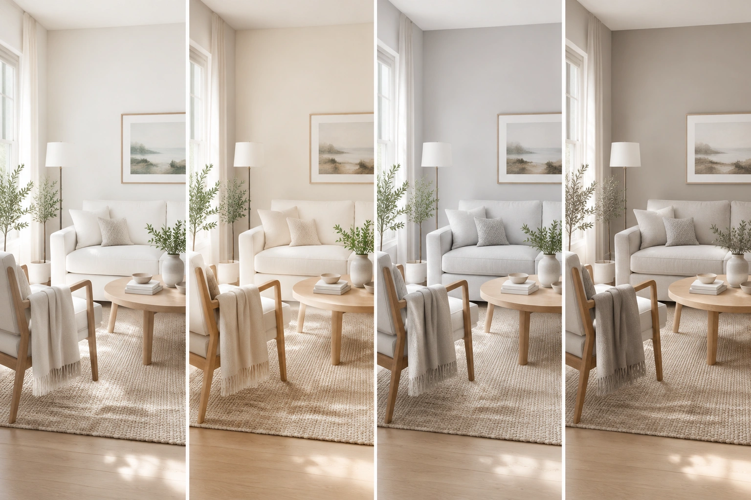
Here is the simple comparison I use when helping people think through a small living room palette.
| Color family | How it affects the room | Best light conditions | Main risk |
|---|---|---|---|
| White | Bright, crisp, very open | Good to excellent natural light | Can feel cold, flat, or stark |
| Off-white | Airy but softer than pure white | Most small rooms | Can read yellow or gray if undertone is off |
| Cream | Warm and inviting, still light | Cooler rooms or low light | Too much yellow can feel dated or muddy |
| Pale gray | Clean and modern, can recede visually | Bright rooms with enough daylight | Can look flat or chilly in dim light |
| Greige | Balanced warmth with softness | Mixed light conditions | Some versions become muddy in dark rooms |
| Soft beige | Cozy, calm, easy to live with | Low-light or north-facing rooms | Can look heavy if too saturated |
| Pale blue or sage | Light, fresh, slightly colored | Rooms that need airiness with personality | Too much saturation can shrink the room |
| Dark accent colors | Add depth and drama in small doses | Rooms with strong light or one focal wall | Can visually narrow the room if overused |
If you want the easiest win, choose a light neutral with a soft undertone. That gives you the spacious feel without making the room look like a blank box.
How to choose the right base color for your light level
Natural light changes everything. If you are deciding between white, off-white, gray, greige, or a pale color, use the room’s light level and orientation as your guide.
Quick decision guide
-
Bright south- or west-facing room:
Start with white, pale gray, or a cooler off-white if you want a crisp look. If the room already feels warm, a soft gray or clean off-white can keep it from feeling washed out. -
North-facing or dim room:
Start with off-white, cream, greige, or a pale warm neutral. These usually feel more forgiving than a cool gray, which can look flat in low light. -
Mixed light or changing light through the day:
Start with greige or a balanced off-white. These are often the safest middle ground when the room gets both bright and shadowed periods. -
You want the lightest possible look without a stark white box:
Choose off-white first. It usually gives you the airy effect of white with a softer, more livable feel. -
You want a fresher, cooler look and the room has enough daylight:
Try pale gray or a very light blue-gray. These can make the walls feel like they recede a little more.
White vs. off-white vs. gray
- White is the brightest and crispest option, but it can feel stark if the room is small and the light is weak.
- Off-white is often the most flexible choice because it stays light without feeling severe.
- Gray works best when the room has enough daylight to keep it from looking flat or chilly.
A useful rule of thumb
The less natural light you have, the softer and warmer the base color should be. You are trying to avoid a color that looks muddy in shadow or too sharp in bright spots.
Warm vs. cool colors: which feels larger?
Both can work, but they create different effects.
Cool colors like pale blue, soft gray, and some blue-tinted whites often feel more expansive because they visually recede. They can be excellent in rooms with enough daylight, especially if you want a clean, calm look.
Warm colors like cream, beige, and warm off-white feel inviting and lived-in. They may not “expand” a room quite as much as a cool tone, but they can still make a small living room feel open when the color is light and the contrast stays low.
The trade-off is simple:
– Cool palette = airier, cleaner, sometimes less cozy
– Warm palette = softer, cozier, sometimes less crisp
If your room already feels chilly, a warm light neutral usually wins. If your room feels visually crowded but gets decent light, a cool pale tone can help the walls seem to step back.
Match undertones carefully
Undertones are where many small-room color choices go wrong.
A white that looks fresh in the store can turn yellow in your living room. A gray that seems elegant on a chip can read blue or muddy once it is on all four walls. A beige can feel warm and calm, or it can become dull and heavy.
Here is the practical test I use:
1. Put samples on at least two walls
2. Look at them morning, afternoon, and evening
3. Compare them next to your sofa, rug, and trim
4. Ask whether the color looks soft and open or dirty and closed in
You are looking for a color that supports the room instead of fighting the light.
Use ceiling, trim, and wall color to reduce visual breaks
A small room feels larger when your eye does not keep hitting hard transitions.
Ceiling color
If your ceiling is low, painting it the same color as the walls is often the best choice when you want the room to feel taller and more continuous. That works especially well in narrow rooms, awkward layouts, or spaces where you want to minimize boxy edges.
If you want a little more lift, keep the ceiling only slightly lighter than the walls. That gives a subtle brightening effect without creating a sharp line that breaks the room apart.
Trim color
Trim does not have to be ultra-bright white. In a small living room, a trim color that stays close to the wall color can help the room feel continuous. That is especially useful in rentals or older homes where trim is already visually busy.
How much contrast to use
In a very small room, keep the contrast between walls, trim, and ceiling low to moderate. High-contrast trim can look crisp in a larger room, but in a compact room it can make every edge stand out more than you want.
A simple step-by-step palette plan
Here is the easiest way to build a room color scheme that feels larger.
-
Choose your base wall color first.
Pick a light neutral, soft white, or muted pastel that suits your light level. -
Decide whether you want warmth or coolness.
If the room is dim, lean warm. If the room is bright, you can go cooler. -
Match the ceiling closely.
Use the same color or a very similar version to reduce visual breaks. -
Keep trim gentle.
Avoid a sharp, high-contrast trim color unless the room has enough size and light to support it. -
Limit accent colors.
One or two supporting colors is usually enough in a small living room. -
Check the palette against the sofa and rug.
If the furniture is dark or busy, simplify the walls. If the walls are soft and quiet, you have more freedom with decor.
This process keeps you from choosing colors in isolation. In a small space, the room works as a whole.
What to do about furniture, rugs, and curtains
Wall color helps, but large furnishings can make or break the sense of space.
Sofas and chairs
A dark sofa in a small room is not automatically wrong, but it becomes visually heavy fast. If your sofa is dark, lighten the walls and keep the other large pieces soft. If you are buying new furniture for a small room, a light or mid-light sofa usually feels less dominant.
A few practical combinations:
– Dark sofa + off-white walls + light rug = grounded, but still open
– Light sofa + pale walls + soft curtains = the easiest way to keep the room airy
– Mid-tone sofa + greige walls + light wood = a balanced option that avoids harsh contrast
If you already own a dark sofa, repeat that darkness in only one or two smaller accents so it looks intentional rather than heavy.
Curtains
Curtains should support height and light. Light-colored curtains, especially in a fabric that does not look bulky, can help the room feel taller and less dense. Hanging them higher than the window frame also helps the eye move upward.
Rugs
A rug with a low-contrast pattern usually works better than a busy, high-contrast one. In a small room, too much pattern can create visual noise. A soft rug in a color that repeats the wall family helps the room feel unified.
Decorative accents
Use accents to repeat, not compete. If the walls are pale gray, bring in cream, soft wood, and one muted accent color rather than five different bright ones.
When dark colors can still work in a small living room
Dark colors are not forbidden. They just need a very deliberate setup.
A dark wall color can work when:
– the room gets enough natural light
– the furniture is streamlined
– trim and accessories stay quiet
– the dark color is used intentionally, not everywhere
A deep color can add depth and make a small room feel dramatic rather than cramped, especially if the rest of the room is light. One smart approach is to keep most surfaces light and use a darker tone on one wall or on a lower-contrast built-in.
Dark colors are most useful in two common scenarios:
– A small room with strong daylight and simple furnishings, where a deep color adds richness without making the room feel closed in
– A small room used for evening relaxation, where a darker palette can feel cozy and intimate rather than visually busy
I would be cautious with dark accent walls in very small, dim rooms. The risk is that the wall comes forward visually and makes the room feel shorter or narrower.
Does paint finish matter?
Yes, but the finish should support the room, not create glare.
- Flat or matte finishes hide wall flaws well and feel softer, but they absorb more light.
- Eggshell is often a strong middle ground for living rooms because it has a little reflection without looking shiny.
- Satin reflects more light and can help brighten a room, but it may also highlight texture or imperfections.
For many small living rooms, eggshell is a practical balance. It gives you some light bounce without making every patch, dent, or uneven wall more noticeable.
Practical color schemes that work in real small living rooms
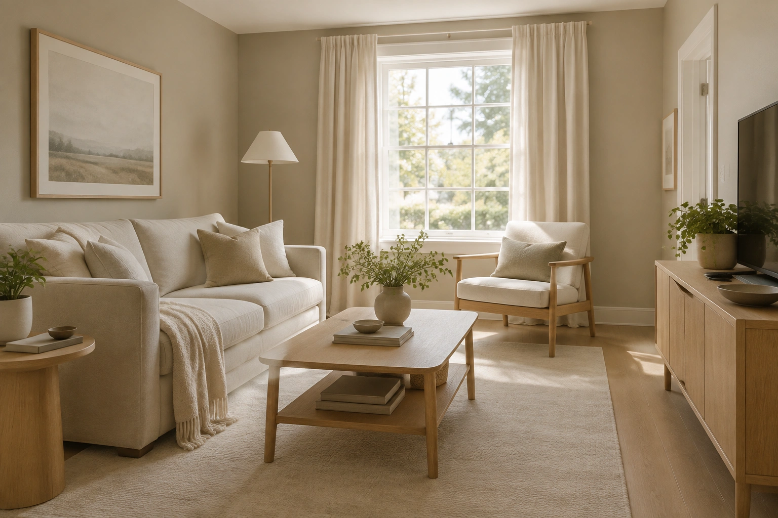
Here are a few combinations that tend to feel open without looking sterile.
1. Low-light, cozy room
- Warm off-white walls
- Matching or near-matching ceiling
- Soft beige curtains
- Light wood accents
- Cream rug
This is a good setup if the room gets limited daylight and you want warmth without heaviness.
2. Bright, modern room
- Pale gray walls
- White or near-white trim
- Light sofa
- Minimal contrast in textiles
- Simple black accents used sparingly
This palette feels crisp and clean, especially in a room with good daylight.
3. Soft, lived-in room
- Greige walls
- Cream curtains
- Natural wood furniture
- Muted green or blue accents
This works well if you want the room to feel larger but still warm and personal.
4. Renter-friendly refresh
If you cannot repaint, use the same principles with non-paint choices. Try removable wall color or peel-and-stick wallpaper in a light tone, large-scale art with a pale background, curtains in a soft neutral or a color that repeats the room’s main palette, and furniture covers or slipcovers in light tones. A pale rug can also do a lot of the work when the walls stay put.
For renters, this is often the fastest path to a room that feels less crowded.
Common mistakes that make a small living room feel smaller
A few choices can undo the spacious effect quickly.
- Bright white walls with harsh trim contrast can make the room feel chopped up.
- Overly saturated accent walls can pull the walls inward.
- Too many competing colors create visual clutter.
- Dark, bulky furniture can overpower a soft wall color.
- Muddy undertones make the room feel dull rather than open.
- Glossy finishes everywhere can create glare and highlight flaws.
If your room already has a lot going on architecturally, simplify the color palette even more. Small rooms usually look better when the eye has fewer places to stop.
Troubleshooting: if the color feels too dark, cold, or flat
If the room does not feel right after painting, diagnose the problem before repainting everything.
If it feels too dark
The color may be too saturated, or the undertone may be too heavy for the light level. Add lighter textiles first: curtains, rug, lamp shades, and a lighter sofa throw can shift the balance.
If it feels too cold
The room may need warmth, not more white. Add cream, beige, wood tones, or a warmer wall color next time.
If it feels flat
The room may need subtle contrast. Use a slightly deeper accent in pillows, art, or a chair so the palette has some depth without becoming busy.
If it feels muddy
The undertone is likely the problem. In low light, some grays and beiges lose clarity. A cleaner off-white or a softer warm neutral may perform better.
Simple rules to follow before you paint
Use this quick checklist before you commit:
- Choose light, soft colors first
- Match the color to your natural light level
- Check undertones in the actual room
- Keep walls, ceiling, and trim close in tone
- Limit high contrast in a small space
- Use eggshell or matte-satin finishes thoughtfully
- Let furniture and textiles support the palette instead of fighting it
If you want the room to feel larger, think calm, continuous, and lightly reflective. That combination usually does more for a small living room than any single “magic” color.
If you are also working on the layout, pairing the right palette with better furniture placement can make the room feel even more open. I’ve shared more layout-focused ideas in my guide to how to make a small living room feel balanced without making it feel crowded, and if your room has tricky door traffic, this small living room with two doors layout guide can help too.
FAQ
Are white walls the only way to make a small living room look larger?
No. Off-white, cream, greige, pale gray, and muted pastels can all make a room feel larger if the undertones and contrast are handled well.
Do dark colors always make a small living room feel smaller?
Not always. Dark colors can add depth, but they work best when used intentionally and balanced with light surfaces and restrained contrast.
Should the ceiling be the same color as the walls?
Often, yes, or at least very close. Matching the ceiling and walls can reduce visual breaks and make a small room feel taller.
Is gray a good color for a small living room?
It can be, especially in a bright room. In low light, some grays can feel flat or cool, so undertone matters a lot.
What is the safest paint finish for a small living room?
Eggshell is often a practical middle ground. It reflects a bit of light without looking too shiny.