
Can One Large Artwork Make a Small Room Look Bigger? A Practical Guide

Yes — one large artwork can make a small room feel bigger, if it creates a clear focal point and doesn’t overwhelm the wall.

That’s the core rule I use when styling compact rooms: fewer visual interruptions, better proportion, and enough breathing room around the piece. A single oversized artwork can calm a busy wall, stretch the eye upward or outward, and make the room read as more intentional. But “large” is not the same as “filling every inch.” If the piece is too busy, too dark, or hung on a wall that’s already crowded, the room can feel heavier instead of more open.
A good target is to choose one piece that looks anchored to the furniture below it, leaves negative space around it, and matches the room’s shape. That’s what creates the spacious effect.
Why a Single Oversized Piece Can Change How a Small Room Feels
Small rooms often feel cramped because the eye has too many stops: little frames, scattered decor, awkward gaps, and competing focal points. One larger artwork simplifies that visual noise. Instead of scanning across several small objects, your eye lands on one main feature and then settles. That creates a cleaner read of the wall.
There are three reasons this works:
1. It reduces fragmentation.
A wall covered in many small pieces can feel chopped up. One large artwork creates one visual unit, which makes the wall feel more continuous.
2. It gives the room a focal point.
When a room has a clear anchor, the rest of the space can feel more organized. The furniture, rug, and lighting all seem to belong together.
3. It uses negative space well.
A small room does not need every wall packed. In fact, a little empty space around a large piece can make the room feel less crowded because the wall can “rest.”
This is why a tall piece, a stacked pair of artworks, or a single vertical composition is often recommended instead of scattering several small frames across the wall. Vertical emphasis can subtly stretch the room’s proportions, which is especially helpful in narrow rooms or spaces with low ceilings. Design references often make this point as a styling guideline rather than a hard rule: a vertical piece or stacked pair can draw the eye upward and make the room read as taller, even though it doesn’t physically change the ceiling height.
Before You Buy: Measure the Wall, Furniture, and Viewing Distance
Before you choose art, look at the wall as a composition, not just an empty surface.
Here’s the simple checklist I use:
-
Measure the furniture beneath the art.
The artwork should visually relate to the sofa, bed, desk, or console it hangs above. -
Measure the uninterrupted wall space.
If the wall already has windows, vents, switches, shelves, or doors crowding it, oversized art may not have enough room to breathe. -
Check the viewing distance.
In a tiny room, people will see the art up close. That means the image should still read clearly from a short distance and not depend on tiny details. -
Look at the room’s visual weight.
Dark furniture, heavy drapes, and lots of pattern already use up visual space. A large artwork can work here, but it should usually be simpler and lighter in feel.
A practical decision rule: if the wall can’t give the artwork some margin on all sides, the piece is probably too large for that spot, even if the dimensions sound impressive on paper.
A quick sizing mindset
Instead of asking, “What is the biggest piece I can fit?” ask, “What size lets the wall feel calm?”
That shift matters. In small rooms, the goal is not maximum coverage. The goal is controlled impact.
A few useful proportion examples
- Above a sofa: a piece that is roughly 2/3 the width of the sofa is usually a safe starting point. For a 90-inch sofa, that often means art around 55 to 60 inches wide.
- Above a bed: try to keep the artwork or grouped pieces to about 2/3 to 3/4 the bed width. For a queen bed, that often means one wide piece or a pair that spans the upper third of the bed area without reaching the edges.
- Above a console: the art can be a bit narrower than the furniture, but it should still feel connected — often around half to 2/3 the console width works well.
Choose the Right Artwork Size, Shape, and Orientation
The shape of the artwork changes the room’s proportions.
Vertical art
Choose vertical artwork when you want the eye to travel upward. This is useful in:
- narrow hallways
- rooms with lower ceilings
- walls beside tall furniture
- compact entries or home offices
Vertical art helps the room feel taller because it reinforces height instead of width. That doesn’t physically change the ceiling, but it can change how the room reads.
Horizontal art
Choose horizontal artwork when the room feels tight from side to side. This works well above:
- sofas
- beds
- long consoles
- wide desks
A wide piece can visually widen the wall and make the furniture below it feel better anchored. In a small living room, that can be a cleaner choice than a tall piece if the room already feels short and broad.
Square art
Square artwork is a strong middle ground when the wall area is compact or when the furniture below it is also visually balanced, like a square coffee table, a centered chair, or a small console. It can work especially well when you want calm symmetry without the strong directional pull of a vertical or horizontal piece.
One large piece vs. several smaller pieces
If your wall feels busy, one large piece usually wins. It creates less visual fragmentation than a gallery wall or a cluster of small frames. But if the wall is long, narrow, or awkwardly shaped, a pair of stacked artworks or a simple two-piece arrangement can sometimes work better than one oversized rectangle because it adds height without taking over the full wall width.
A gallery wall is usually the better choice when you want flexibility, variety, or a collected look and the wall has enough open space to support it. If the room already feels crowded, though, a gallery wall usually adds more visual noise than a single large piece.
Here’s the trade-off:
- One large piece: cleaner, calmer, more spacious-looking
- Several smaller pieces: more flexible, but easier to make the wall feel cluttered
If you’re unsure, choose the option that leaves more wall visible around it.
Pick Colors, Subjects, and Styles That Feel Airy
Size alone won’t do the job. The artwork’s visual “weight” matters just as much.
Better choices for a small room
Look for art that feels open, simple, or softly detailed:
- light backgrounds
- airy abstract shapes
- landscapes with breathing room
- minimal line work
- soft neutrals or muted tones
- compositions with clear empty space
These choices help the wall feel less crowded because they don’t demand constant attention from every inch of the room.
Choices that can make a room feel smaller
Be careful with art that is:
- very dark across most of the surface
- dense with tiny details
- high-contrast in a harsh way
- visually busy from edge to edge
- heavily patterned with no open space
That doesn’t mean dark art never works. It can be beautiful in a small room, especially if the rest of the space is light. But if the room already feels compressed, a heavy image can add more visual pressure.
A useful rule
If the room is already full of texture, choose calmer art.
If the room is very plain, you can handle a bit more contrast.
That balance keeps the wall from fighting the rest of the space.
Frame, Mat, or Canvas: Which Format Works Best in a Small Room?
The format changes how bulky the artwork feels.
Framed art
Framed art gives definition and can make a piece feel polished. It works especially well when the room has other structured elements, like clean-lined furniture or molding.
Best for:
– traditional spaces
– rooms that need a crisp edge
– art that benefits from a clear boundary
A thinner frame can help the work feel lighter, especially when you want the art to sit quietly in the room. Thicker or ornate frames do the opposite and can make the piece feel heavier.
Watch out for:
– thick or ornate frames that add visual weight
– heavy mats that make the piece feel larger than necessary
Canvas art
Canvas often feels lighter because it has less visual edge. That can be a smart choice in a small room where you want the art to blend into the wall more softly.
Best for:
– modern rooms
– casual spaces
– renters who want a clean look without a bulky frame
Trade-off:
– canvas can feel less defined than framed art, so if the wall already looks soft or unfinished, it may need stronger surrounding furniture to anchor it.
Matting
A mat can give breathing room to a smaller image, but too much matting makes the piece physically and visually larger. In a small room, minimal matting is usually enough.
Avoid mats entirely when the artwork is already large enough to stand on its own, or when extra border space would only make the piece feel more oversized. My practical rule: use the simplest format that still feels finished. The more ornate the frame, the more likely it is to shrink the room visually.
Where to Hang Large Art for the Best Space-Expanding Effect
Placement matters as much as size.
Above a sofa
Center the artwork over the sofa so the two read as one unit. This helps the seating area feel intentional instead of floating on the wall.
A good approach:
– keep the art aligned with the sofa centerline
– leave visible wall space around the piece
– avoid hanging it so high that it disconnects from the furniture
If the art is too high, the sofa and artwork stop talking to each other, and the wall can feel taller in a bad way: awkward, not airy.
Above a bed
A wide horizontal piece often works best above a bed because it echoes the bed’s shape. In a small bedroom, this can make the wall feel wider and calmer.
Choose art that is visually restful. Bedrooms usually benefit from less activity, not more.
Above a desk or console
In a home office or entry, a single large piece can replace several small items that would otherwise crowd the wall. Keep it centered over the furniture so the whole setup feels anchored.
In a hallway
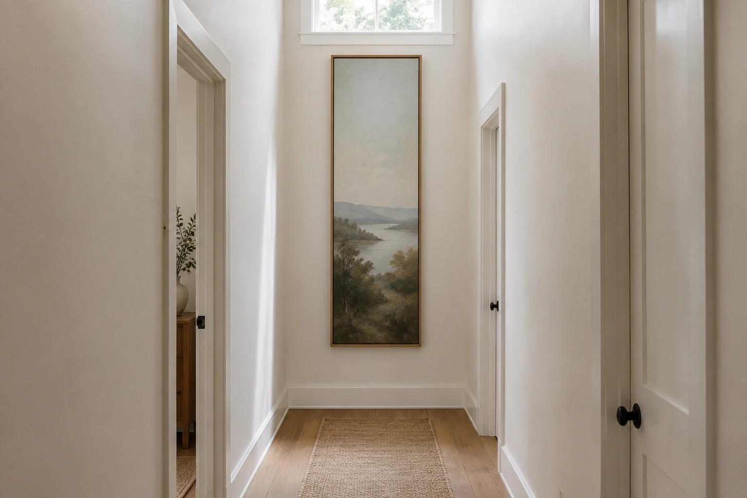
A tall vertical piece can help a narrow hallway feel less tunnel-like. This is one of the strongest uses of oversized art because the wall is usually seen in passing, from a short distance, and a single piece can create a strong visual pause.
Hanging height
Rather than treating art as a separate object, align it with the furniture below it. That usually creates a more balanced, space-friendly result than hanging it high just because the wall is tall.
Step-by-Step: How to Style a Small Room Around One Large Artwork
Here’s the cleanest way to do it.
1. Pick the wall with the least interruption
Choose the wall that gives the artwork room to breathe. A wall with fewer switches, vents, windows, or shelves is usually easier to style.
2. Decide what the artwork should do
Ask whether the room needs:
– more height
– more width
– a calmer focal point
That answer tells you whether to go vertical, horizontal, or square.
3. Match the piece to the furniture
The artwork should feel like it belongs to the sofa, bed, or desk below it. If the furniture is visually heavy, the art can be more open and light. If the furniture is very simple, the art can carry a little more presence.
4. Keep the surrounding decor restrained
Once the art is large, nearby accessories should step back. Use fewer objects on shelves, simpler lamp shapes, and less competing wall decor.
5. Add light that supports the piece
Good lighting helps the artwork read clearly instead of disappearing into a dim corner. A picture light, nearby lamp, or well-placed ceiling light can make a big difference.
6. Step back and check the balance
If the wall still feels crowded, remove one nearby object before changing the art. Often the issue is not the artwork itself but everything competing with it.
Common Mistakes That Make Oversized Art Feel Too Heavy
A large piece can absolutely backfire. These are the mistakes that usually cause it.
Hanging it too high
This is the most common one. When the art floats far above the furniture, the room can feel stretched in an awkward way instead of open.
Choosing art that is large but visually busy
A huge piece with dense detail can feel like a lot of pressure on a small wall. Bigger is not always lighter.
Using an ornate frame
Heavy frames can make the artwork feel like a formal object that dominates the room. In small spaces, that often reads as clutter.
Placing it on the wrong wall
If the wall already has too much going on, the art has nowhere to breathe. The result is visual competition, not calm.
Ignoring the room’s lighting
A dimly lit artwork can lose impact and feel heavier than it should. If the piece disappears, the room loses the very focal point it needed.
Troubleshooting: When Large Art Makes the Room Feel Smaller Instead
If the room feels worse after you hang the piece, here’s how to diagnose the problem.
If the room feels heavy
The art may be too dark, too dense, or too framed. Try a lighter composition or a thinner frame.
If the wall feels crowded
The problem may be scale plus surrounding decor. Remove nearby wall pieces, reduce shelf clutter, or move the art to a cleaner wall.
If the art feels disconnected
It’s probably hung too high or too far from the furniture. Re-center it over the piece below it.
If the room feels flat
Improve the lighting before changing the artwork. A well-lit piece reads as intentional; a dim piece can feel like a dark patch.
If the room feels narrow
Try a horizontal piece instead of a vertical one, or switch to a composition with more open negative space.
Room-by-Room Examples
Living room
A small living room usually benefits from one large piece above the sofa. This creates a single strong focal point and helps the seating area feel organized. If the room is narrow, a horizontal piece often works better than a tall one.
You may also find this helpful: how to make a small living room feel balanced.
Bedroom
Bedrooms usually do best with calm, wide artwork above the bed. The goal is to soften the wall, not energize it. A simple landscape, abstract, or minimal print often works better than a busy image. If the room is especially small, keep the palette quiet and avoid art that competes with bedding or nightstands.
Hallway
A hallway is one of the best places for tall art because it draws the eye upward and creates a pause in a tight passage. Keep the rest of the hallway simple so the art can do the work. If the wall is especially narrow, one vertical piece is often better than several smaller frames.
Home office
A single large piece above a desk can make a work zone feel cleaner and less fragmented. This is especially useful if your desk already holds monitors, papers, or supplies. Choose something calm enough to support focus, and keep the wall behind the desk from becoming another source of distraction.
When One Large Artwork Is Not the Best Choice
Sometimes a single oversized piece is not the right answer.
Choose something else if:
- the wall is broken up by windows or built-ins
- the room already has a strong focal point
- the furniture below the wall is very small
- the space needs flexibility more than drama
- the wall is too short to give a large piece breathing room
In those cases, a restrained pair of artworks or a very simple mini-gallery may work better. The key is still the same: fewer visual interruptions, better proportion, and enough empty space to let the wall feel calm.
If you’re planning the whole room at the same time, it can help to think about the furniture layout first. I also cover that in how to plan a small living room before buying furniture, because art works best when the room’s main pieces are already in proportion.
Quick Answer to Keep in Mind
So, can one large artwork make a small room look bigger?
Yes — when it creates one clear focal point, fits the furniture beneath it, and leaves enough negative space around it to breathe. The best results usually come from simple compositions, restrained framing, and thoughtful placement, not from sheer size alone.
FAQ
What size artwork works best above a sofa?
A common starting point is artwork that spans about two-thirds the width of the sofa. That usually looks balanced without overwhelming the seating area.
Is vertical or horizontal art better in a small room?
It depends on the room’s shape. Vertical art can help a room feel taller, while horizontal art can help a room feel wider and more grounded.
Should I use a frame or canvas in a small room?
Use whichever format creates the lighter look for the space. Canvas often feels softer, while a thin frame can help art feel more finished without adding too much weight.
Can a gallery wall work in a small room?
Yes, but it works best when you want a collected look and the wall has enough open space. If the room already feels busy, one large piece is usually calmer.
Does dark art always make a room feel smaller?
Not always. Dark artwork can work well if the room has enough light and the rest of the decor stays simple. But in a cramped or dim space, it can feel heavier.