
Should Furniture Match the Wall Color in a Small Room? A Practical Guide to Making Tight Spaces Feel Bigger

If your goal is to make a small room feel calmer, brighter, and less chopped up, furniture and wall color should usually coordinate closely—but they do not need to be an exact match.
That’s the short answer.
In a small room, the safest rule is this: blend first, contrast second. When furniture sits near the wall color in tone, value, or undertone, the room often reads as one continuous space instead of a series of visual breaks. That can help the room feel more open. But if everything matches too perfectly, the room can go flat. A little contrast—usually through texture, finish, a rug, or one darker accent piece—keeps the space from feeling washed out.

Think of it like this:
– Close match = calmer, more expansive look
– Moderate contrast = more depth and definition
– Too much contrast = busier, smaller-feeling room
For small rooms, I usually recommend choosing furniture that either:
1. Blends with the wall color, or
2. Creates controlled contrast in only one or two places
That balance gives you the spaciousness you want without losing all personality.
Quick Answer: Should Furniture Match the Wall Color in a Small Room?
Yes—close color coordination often helps a small room feel larger, especially when the room already has limited natural light or a lot of visual interruptions.
But “match” is the part that needs care.
An exact wall-to-furniture match can make a room feel flat, especially if the furniture, walls, trim, and flooring all sit in the same value range. What usually works better is tone-on-tone decorating: colors that live in the same family, even if they are not identical. For example, soft white walls with cream upholstery, or pale gray walls with a warm greige sofa.
That approach keeps the eye moving smoothly around the room. Fewer hard stops usually means the space feels less crowded.
If you want the room to feel:
– Bigger and quieter: lean toward blending
– More styled and dimensional: add measured contrast
– More dramatic: use contrast carefully, not everywhere
How Matching, Contrast, and Visual Weight Affect a Small Room
Small rooms are sensitive to visual weight. A piece of furniture can feel physically light but visually heavy if it is dark, bulky, glossy, or sharply contrasted against the wall.
When furniture blends with the wall
When furniture is close to the wall color, the boundary between the two softens. That can make the room feel less segmented. A sofa in soft beige against warm white walls, for example, won’t shout for attention. Instead, it becomes part of the room’s overall field.
This works especially well when the room has:
– one main seating piece
– limited square footage
– not much natural light
– a simple layout
When contrast helps
Contrast gives the eye something to read as structure. A charcoal chair in a pale room, or a black side table beside a light sofa, can prevent the space from feeling washed out. The key is restraint: in a small room, one to three contrasting elements is usually enough before the space starts to feel busier than it should.
Source: general design guidance
When contrast hurts
Too much contrast in a small room can make every object feel separate. Dark sofa, dark coffee table, dark rug, dark curtains, and strong wall color? The room can start to feel visually chopped up, even if the furniture fits physically.
A useful rule:
– Use blending for the largest pieces
– Use contrast for the smallest pieces
– Use texture to bridge the two
That keeps the room from feeling flat without creating a patchwork effect.
Before You Choose: What to Check in Your Room
Before buying anything or repainting, look at the room as a whole. Furniture color never acts alone.
1. Wall color and undertone
Two whites can behave very differently. One may lean warm and creamy; another may lean cool and icy. The same goes for gray, beige, and greige. If the undertones clash, the room can feel off even when the colors seem “neutral.”
A warm wall usually pairs more easily with:
– cream
– beige
– honey oak
– soft greige
– warm white
A cool wall usually pairs more easily with:
– crisp white
– pale gray
– blue-gray
– black accents
– cooler wood tones
2. Flooring
Flooring is often the missing piece people forget. If your floor is dark, adding dark furniture can sink the room visually. If your floor is very light, a room can feel washed out unless you add some grounding contrast somewhere.
3. Trim and doors
Trim acts like a frame. Bright white trim against colored walls creates more edge definition. If the room is small, that can be helpful—but only if the furniture doesn’t add even more boundary lines.
4. Natural light
Rooms with limited daylight usually benefit from lighter furniture and softer contrast. Rooms with strong daylight can handle a little more depth.
5. What you already own
If you are keeping the sofa, bed, or dining table, treat that piece as the anchor. Then build the wall color, rug, curtains, and smaller accents around it.
Tools and Materials for Planning a Cohesive Small-Room Palette
You do not need a full design plan to make a smart choice. A few simple tools make the decision much easier.
- Paint swatches or wall samples to compare undertones
- Fabric samples for upholstery, curtains, or pillows
- A phone camera to take quick room photos and compare options side by side
- A white sheet of paper to help you judge undertone next to stronger colors
- A lamp or bulb sample if the room lighting is warm or cool
- A small rug sample or throw blanket if you want to test how much contrast the room can handle
Take photos in daylight and at night. A palette that feels soft in morning light can look much heavier after dark.
Step-by-Step: How to Choose Furniture Color for a Small Room
1. Decide the room’s main job
Ask yourself what matters more:
– making the room feel bigger
– adding style and depth
– hiding visual clutter
– creating a focal point
If the room is already cramped, spaciousness usually wins.
2. Look for the dominant surface
In most small rooms, the biggest visual surfaces are the walls, sofa or bed, flooring, and curtains. Your furniture should work with those surfaces, not fight them.
3. Choose your color strategy
Pick one of three paths:
Blend
Use this when you want the room to feel softer and more open.
Example: beige sofa + warm white walls.
Moderate contrast
Use this when the room needs a little structure.
Example: light gray walls + charcoal chair + pale sofa.
Accent-first
Use this when you already have a simple base and want one piece to stand out.
Example: white walls + neutral furniture + one deep green chair.
4. Keep the largest piece closest to the wall color
The biggest item in the room has the biggest visual impact. If the sofa, bed, or dining table is close to the wall color, the room usually feels less broken up.
5. Add contrast in smaller doses
If everything is the same value, the room can feel dull. Add contrast through:
– pillows
– lamps
– side tables
– artwork
– a darker throw
– a textured rug
6. Check the room from the doorway
Stand where you enter and look at the room as a whole. If your eye jumps from one dark shape to another, the palette may be too fragmented. If the room feels like one soft field with a few anchors, you’re close.
Best Furniture Color Choices for Common Wall Colors
White walls
White walls are flexible, but they can become stark if the furniture is also bright white with no texture.
Best pairings:
– cream sofa
– light oak table
– beige lounge chair
– soft gray upholstered pieces
If you want contrast, use it sparingly:
– black lamp
– walnut side table
– charcoal accent chair
This gives the room definition without turning it into a high-contrast grid.
Beige walls
Beige walls work well with warm, layered neutrals. The risk is sameness.
Best pairings:
– cream
– greige
– sand
– pale oak
– warm taupe
To keep beige from feeling muddy, vary the finish. A linen sofa, matte wood table, and woven basket bring more life than three smooth beige surfaces in a row.
Gray walls
Gray walls are where furniture choice matters most. Cool gray with dark furniture can read cold and heavy. In small rooms, light warm furniture often softens that effect.
A useful guide from general design guidance is that in small spaces, gray walls often pair well with light, warm furniture such as pale oak, beige, cream, and soft greige upholstery, because those tones brighten the room and help keep it from feeling cold.
Good options:
– pale oak
– cream upholstery
– soft greige
– warm white bedding
– light walnut accents
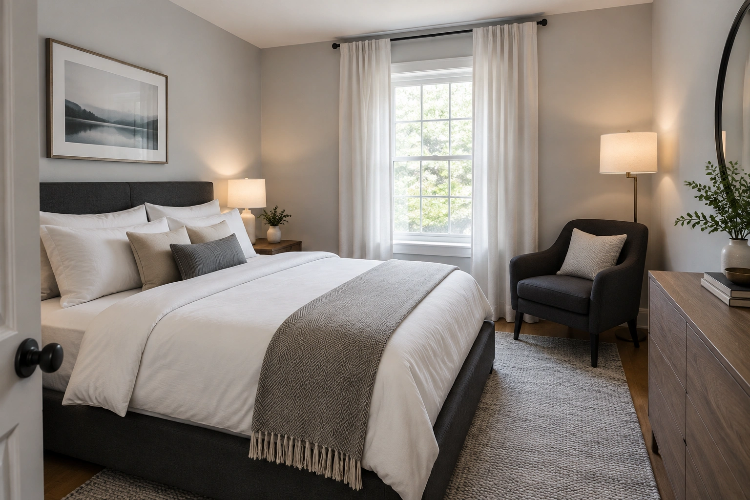
If you want a darker piece, keep it to one item so the room still feels airy.
Colored walls
With colored walls, the goal is usually to avoid a fight between the wall and the furniture.
If the walls are muted blue, green, pink, or terracotta, choose furniture that is:
– soft neutral
– slightly deeper or lighter than the wall
– in the same undertone family
For example:
– pale blue walls + white oak, cream, or blue-gray furniture
– navy walls + walnut, camel, or soft gray upholstery
– sage walls + warm white, light oak, or natural linen pieces
– forest green walls + cream, tan leather, or medium wood furniture
– dusty pink walls + ivory, pale oak, or soft taupe furniture
– blush walls + warm white, light gray, or natural wood furniture
– terracotta walls + cream, beige, oak, or muted brown furniture
– muted coral walls + ivory, sand, or light walnut pieces
A similar-tone furniture piece can feel intentional without disappearing completely.
How to Add Depth Without Making the Room Feel Crowded
When furniture and walls stay close in color, the room needs other forms of contrast.
Use texture, not more color
Texture creates depth without adding visual noise. A room with cream walls and a cream sofa can still feel layered if you mix:
– linen
– boucle
– wood grain
– matte ceramics
– woven baskets
– nubby rugs
Use finish to change the light
Flat, matte, and textured finishes absorb light differently. Glossy surfaces reflect more and can feel busier. In a small room, too many shiny pieces can create visual flicker. A matte table, soft fabric, and woven shade usually feel calmer.
Use rugs as a bridge
A rug can connect wall and furniture colors. If your sofa is light and your walls are light, a rug with a slightly deeper border or pattern can add structure without making the room feel heavier.
Use one or two accent pieces
Smaller pieces are the easiest place to add contrast. The DIY Playbook notes that side tables, lighting, throw pillows, and accent decor are useful for reinforcing the palette and connecting the room visually. That’s especially helpful in rentals, where you may not control the walls.
Source: The DIY Playbook on matching furniture thoughtfully
Common Mistakes That Make Small Rooms Feel Smaller
Exact color matching
If the furniture and wall are too close but not quite the same, the mismatch can look accidental. If you are going tone-on-tone, make the difference clear enough to feel deliberate.
Too much dark furniture
A single dark piece can look elegant. Several dark pieces can feel heavy, especially in a room with limited daylight.
Ignoring undertones
Warm beige next to cool gray can feel awkward even if both are “neutral.” Undertone mismatch is one of the fastest ways to make a small room feel unsettled.
Harsh contrast everywhere
If every major item competes, the room feels busier. Keep contrast focused in a few places.
Busy finishes
Shiny lacquer, strong pattern, and multiple wood tones can be too much in a tight room unless the rest of the palette is very quiet.
Troubleshooting: What to Do If the Room Looks Flat, Busy, or Mismatched
If the room looks flat
Add one darker anchor:
– a black lamp
– a charcoal pillow
– a walnut stool
– a framed print with deeper tones
You do not need more color everywhere. You need a little visual punctuation.
If the room looks busy
Pull back the contrast. Replace one high-contrast item with something closer to the wall color or swap a patterned textile for a solid one.
If the room feels mismatched
Repeat one color or wood tone at least twice. For example, if you have a walnut coffee table, echo that tone in a picture frame, lamp base, or tray. Repetition makes a mixed room feel intentional.
If the room feels cold
Bring in warm materials:
– oak
– cream textiles
– brass
– woven shades
– warm bulbs
Small rooms often need warmth more than more color.
Practical Examples for Renters and Small Spaces
Rental living room with off-white walls and mixed furniture
If you cannot paint, use a shared neutral base. A beige or cream rug, light curtains, and one repeated wood tone can make mismatched pieces feel connected. If the sofa is gray and the chair is wood-framed, bridge them with pillows that sit between those colors.
Tiny bedroom with gray walls
A charcoal bed frame can work if the bedding and curtains are light. The darker frame gives structure, while the soft textiles keep the room from feeling boxed in. This is a good example of using contrast in one major piece and blending everywhere else.
Compact dining nook
A light wood table against dark walls can keep the space from feeling too heavy. Add simple chairs in a tone that echoes either the table or the wall, not both. That keeps the nook from becoming visually noisy.
Small office
A desk in a muted version of the wall color can almost disappear, which is useful when you want the room to feel orderly. Then add a lamp or chair in a slightly deeper tone so the setup still has definition.
If you want more help with layout alongside color, these guides can help you think through the room as a whole: how to place furniture against every wall in a small room, when to float furniture in a small living room, and whether a small living room needs a focal point.
Simple Decision Rules You Can Use Right Now
Use these quick rules when you’re stuck:
- If the room is very small and underlit, choose furniture that blends with the walls.
- If the room has strong flooring contrast already, keep the furniture closer to the wall color.
- If the room feels flat, add one darker accent piece.
- If the room already has strong contrast in flooring or trim, soften the furniture color.
- If the walls are cool gray, lean warm with the furniture.
- If the walls are colored, keep furniture neutral or slightly muted.
- If you cannot change the walls, use rugs, pillows, lamps, and art to build cohesion.
- If you want the room to feel larger, prioritize visual continuity over bold contrast.
A simple way to decide is this: in a very small room, blend the largest pieces, then use one or two accents for definition; in a larger or brighter room, you can handle a little more contrast.
The best small-room palette is usually not the one that matches perfectly. It’s the one that feels coordinated enough to calm the eye, varied enough to stay interesting, and simple enough that the room can breathe.
FAQ
Does matching furniture to wall color make a small room look bigger?
Usually, it can help a small room feel bigger because the eye sees fewer hard breaks. It also tends to make the room feel calmer and less cluttered.
Is exact matching better than contrast?
Not usually. Exact matching can look flat or accidental. In most small rooms, a tone-on-tone look with a little contrast is more effective.
How much contrast is too much in a small room?
As a rule of thumb, if more than about one to three major elements are strongly darker or lighter than the rest, the room can start to feel visually busy. Keep contrast focused instead of spreading it everywhere.
What if my walls are already dark?
Use lighter furniture, lighter textiles, and reflective finishes to keep the room from feeling too enclosed. One dark wall color can work well if the larger furniture pieces are lighter.
What is the safest furniture color for a small room?
Light neutrals are usually the safest starting point: cream, soft beige, pale oak, light gray, or warm white. Then add one or two accent pieces for depth.
Can I mix warm and cool tones in a small room?
Yes, but keep the balance intentional. One temperature should lead, and the other should show up in smaller doses so the room still feels cohesive.
Do I need all furniture to match the wall color?
No. It’s usually better if the biggest pieces coordinate with the wall color while smaller items provide contrast and texture.
What if I rent and can’t paint?
Focus on rugs, curtains, lamps, pillows, and art to build a cohesive palette around the wall color you already have.